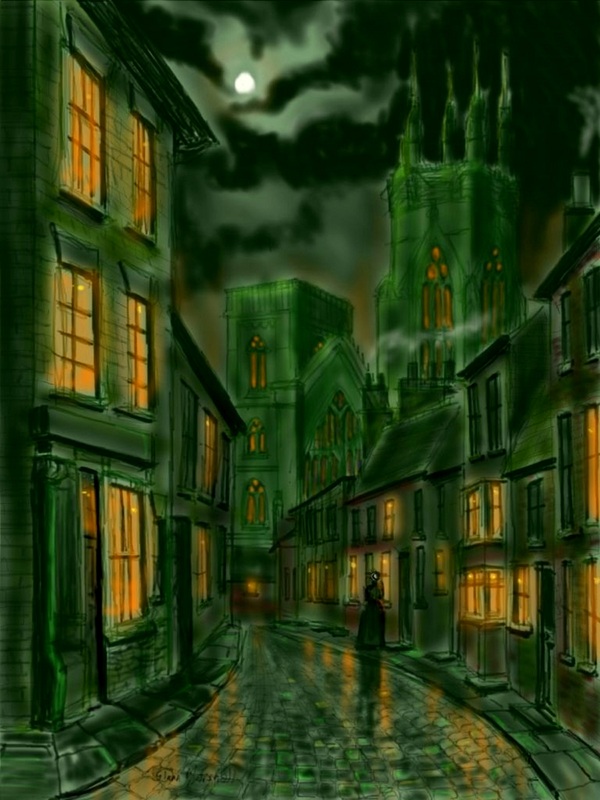
Bridlington Priory and Kirkgate by Moonlight.
Bridlington Priory is celebrating its 900th anniversary this year. To mark the occasion there will be lots of events taking place in and around the Priory including an auction of art work. This is my contribution and is an iPad painting based on a black and white photograph taken round about the turn of the 20th century of Kirkgate leading up to the Priory itself.
I like working with old black and white prints. For a start off there are no colour distractions which always makes it easier to do the drawing....and that was important as it is quite a detailed scene. Secondly I can use my imagination and use whatever colours I want ! I thought this would be an ideal scene for a 'nocturne' or moonlight painting. There is no better painter of moonlight than John Atkinson Grimshaw (no..not even Whistler!) so I tried to imagine how he would have set about capturing this scene. The reflections in the wet cobbles certainly set the atmosphere and the lone girl adds an aura of mystery. Is she going to the Priory? Why is she on her own on a damp night like this? You can ask your own questions and give your own answers but she does manage to involve us.
I like working with old black and white prints. For a start off there are no colour distractions which always makes it easier to do the drawing....and that was important as it is quite a detailed scene. Secondly I can use my imagination and use whatever colours I want ! I thought this would be an ideal scene for a 'nocturne' or moonlight painting. There is no better painter of moonlight than John Atkinson Grimshaw (no..not even Whistler!) so I tried to imagine how he would have set about capturing this scene. The reflections in the wet cobbles certainly set the atmosphere and the lone girl adds an aura of mystery. Is she going to the Priory? Why is she on her own on a damp night like this? You can ask your own questions and give your own answers but she does manage to involve us.
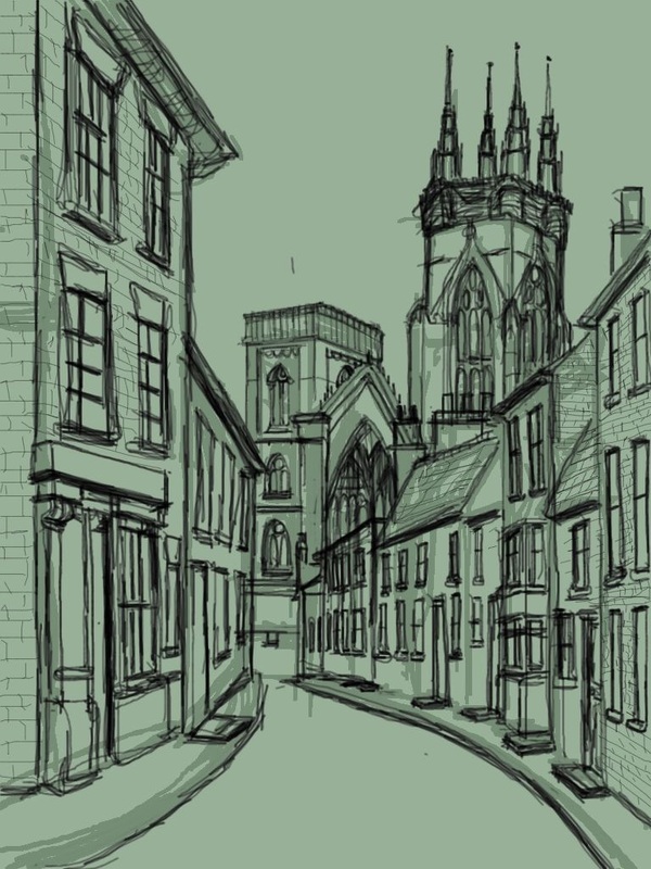
One of the great advantages of the iPad is that you can save your work at every stage. This was the finished drawing and as you can see it is very detailed. I don't usually put so much in a drawing but I was pleased with the way it turned out. I very quickly sketched in the buildings to get the shapes and the perspectives right before washing in a pale green colour over the whole lot. I then reworked the drawing over my original marks but this time taking more time and care to get to this stage. The painting was built up as normal from here.
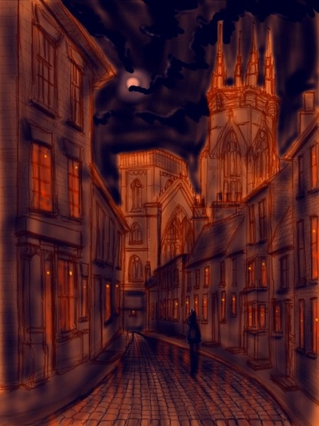
However because this drawing was saved it means I can use it over and over again without all the boring bit (and painstaking bit!) of having to redraw it. Blue and orange are complementary colours so I thought it would be fun to work over the sketch using just those two colours. The painting was never intended to be totally representational so I left the drawing lines to show through very clearly and also deliberately highlighted the Priory itself.
However because this drawing was saved it means I can use it over and over again without all the boring bit (and painstaking bit!) of having to redraw it. Blue and orange are complementary colours so I thought it would be fun to work over the sketch using just those two colours. The painting was never intended to be totally representational so I left the drawing lines to show through very clearly and also deliberately highlighted the Priory itself.
You can purchase prints of either image by clicking on the painting, but if you interested in participating in the auction on behalf of this wonderful historic building please contact me and I will send you full details when they are available.
 RSS Feed
