|
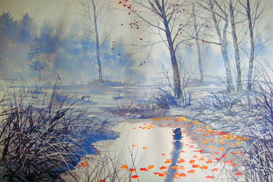
As a painter I am always interested in what is going on in the art world. A few years ago there was a bit of a vogue for paintings in very subdued hues but featuring single splashes of colour. I liked some of the work and as “imitation is the sincerest form of flattery”, I thought why not give it a go. Not that working in subdued colours was a new thing for me. Ever since I began to paint I have used as few colours as possible. This makes you concentrate on getting the tones right as well as guaranteeing harmony in the painting. I have noticed that lots of painters confuse colour and tone. Put simply the tone is the strength of colour used so that it is paler in the distance and gets stronger towards the foreground. So even if you use only one colour you can get depth in a painting and that all important illusion of space, providing you manage to get the tones right. So back to Strensall Common - another of my favourite locations - for this simple piece. The whole painting except for the leaves was done with just two colours – French ultramarine and madder brown. I had masked the leaf shapes and when the rest was completely dry painted them individually mixing red and yellow wet in wet to avoid a flat orange. Although I didn't pursue this particular method to any great degree, you will always find the same control of tone no matter what colour or colours I use in my work.
0 Comments
Leave a Reply. |
AuthorProfessional artist now semi retired and enjoying being eccentric! Archives
September 2022
|

 RSS Feed
